
From Literal to Enduring
As Onyx Property Capital evolved from property operator to investment platform, its brand needed to reflect a similar level of maturity. The existing identity relied on a literal illustration of onyx stone contained within an "O" mark. The mark lacked the sophistication, flexibility, and distinctiveness needed to support the company's next chapter. My goal was to move beyond decoration and create a visual system rooted in the deeper qualities of onyx: strength, depth, refinement, and formation over time.
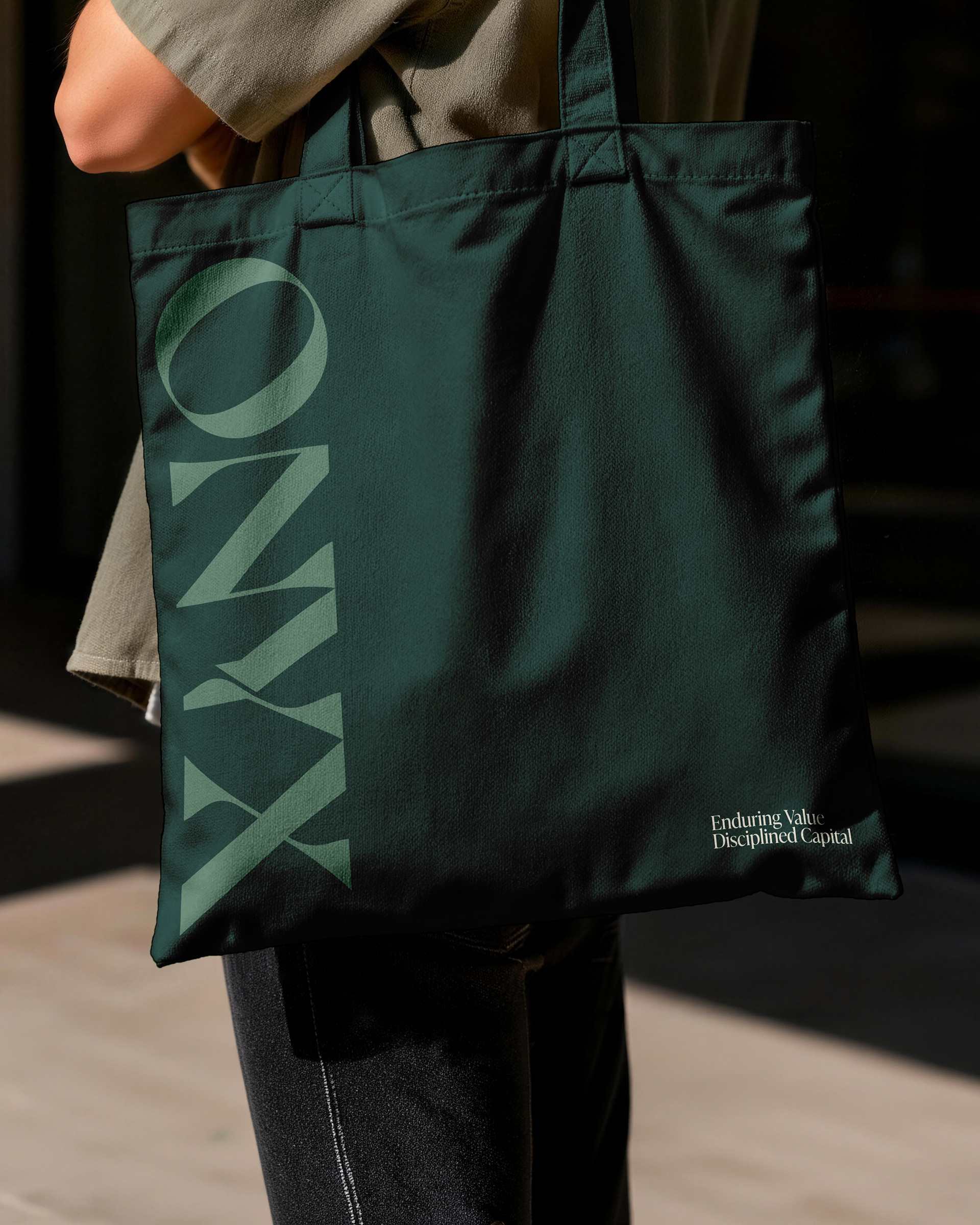
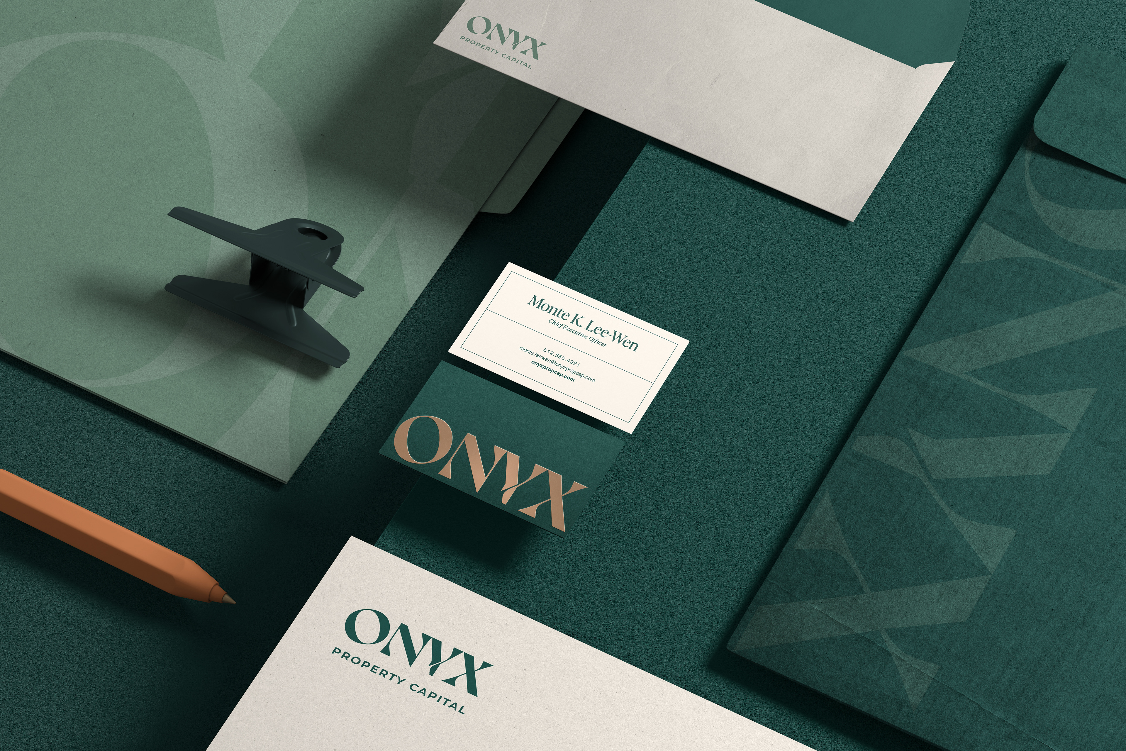
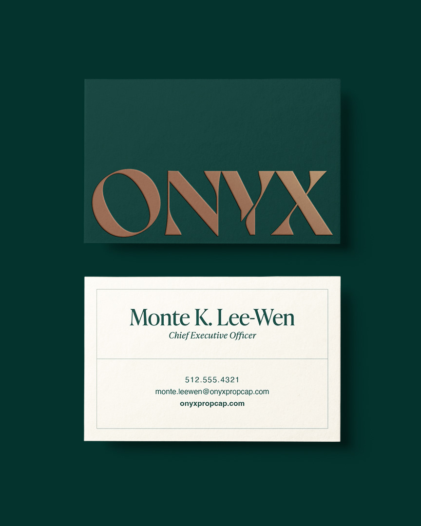
Rather than illustrating stone directly, I drew inspiration from the natural characteristics of cut onyx. The custom wordmark features soft curves and sculpted forms that echo the flowing contours found within the stone itself. A deliberate cut through the "Y" references the striations that form over time, introducing a subtle layer of movement and depth. The result is a mark that feels timeless and ownable.


Building a Complete Visual Language
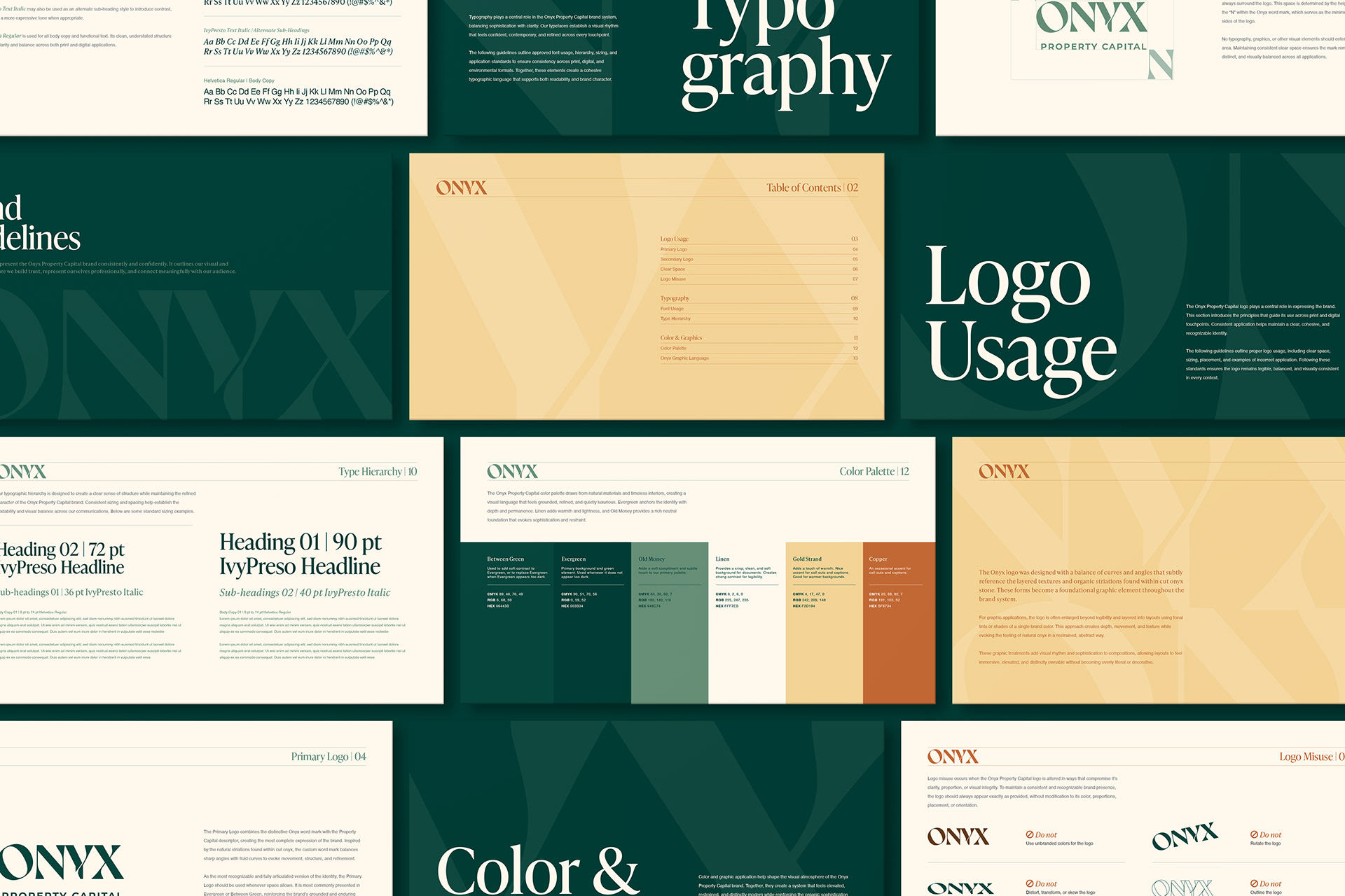
The identity extends beyond the logo through a palette derived directly from natural onyx formations. Evergreen, Old Money, and Linen establish a foundation of growth, wealth, and stability, while Gold Strand and Copper introduce moments of warmth and balance. Typography plays a central role throughout the system, with IvyPresto bringing together sophistication, trust, and modern refinement. Oversized letterforms become graphic textures, creating layered compositions that reinforce the organic patterns found in stone. Together, these elements transform Onyx from a company with a logo into a brand with a recognizable visual language.