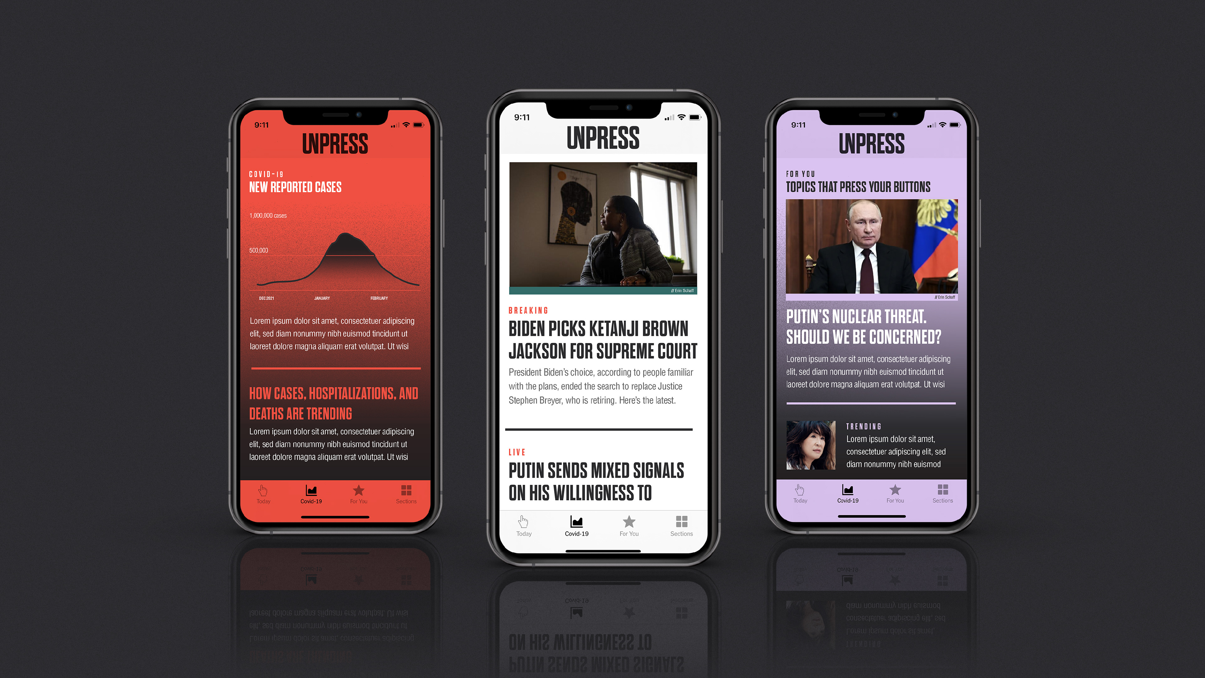
The Ask
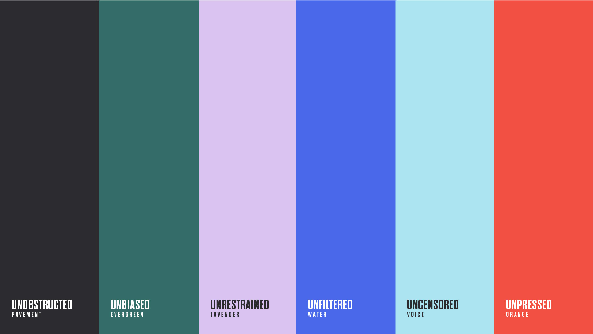
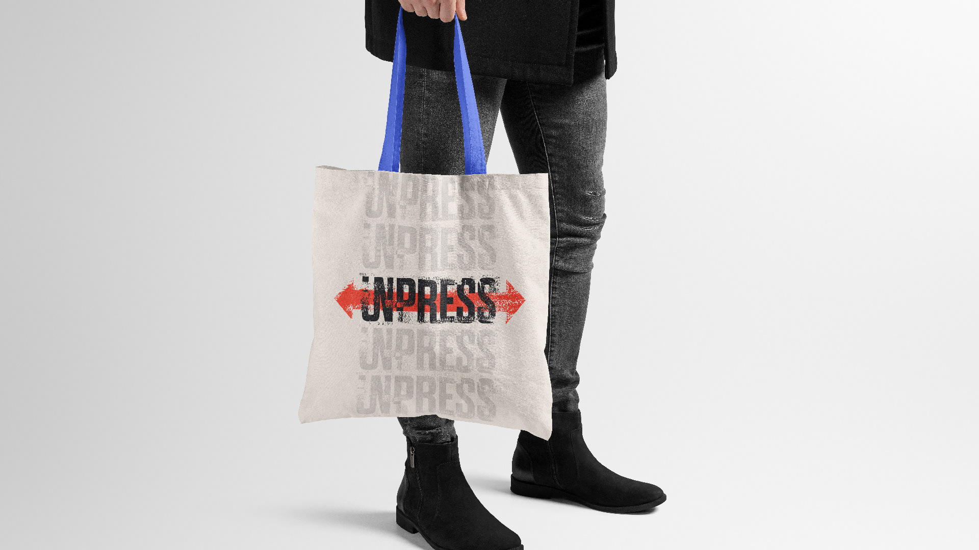
In addition to the branding, I also named UnPress. Why UnPress? They aim to separate themselves from current media platforms, and create a new form of journalism. The archetype for UnPress is the Outlaw. I wanted to design a brand that fully embodied the outlaw by utilizing a grunge and punk rock take on where the press should be. This brand embodies hitting the streets, smearing the ink, and stamping your mark on the world. UnPress is about igniting a revolution.
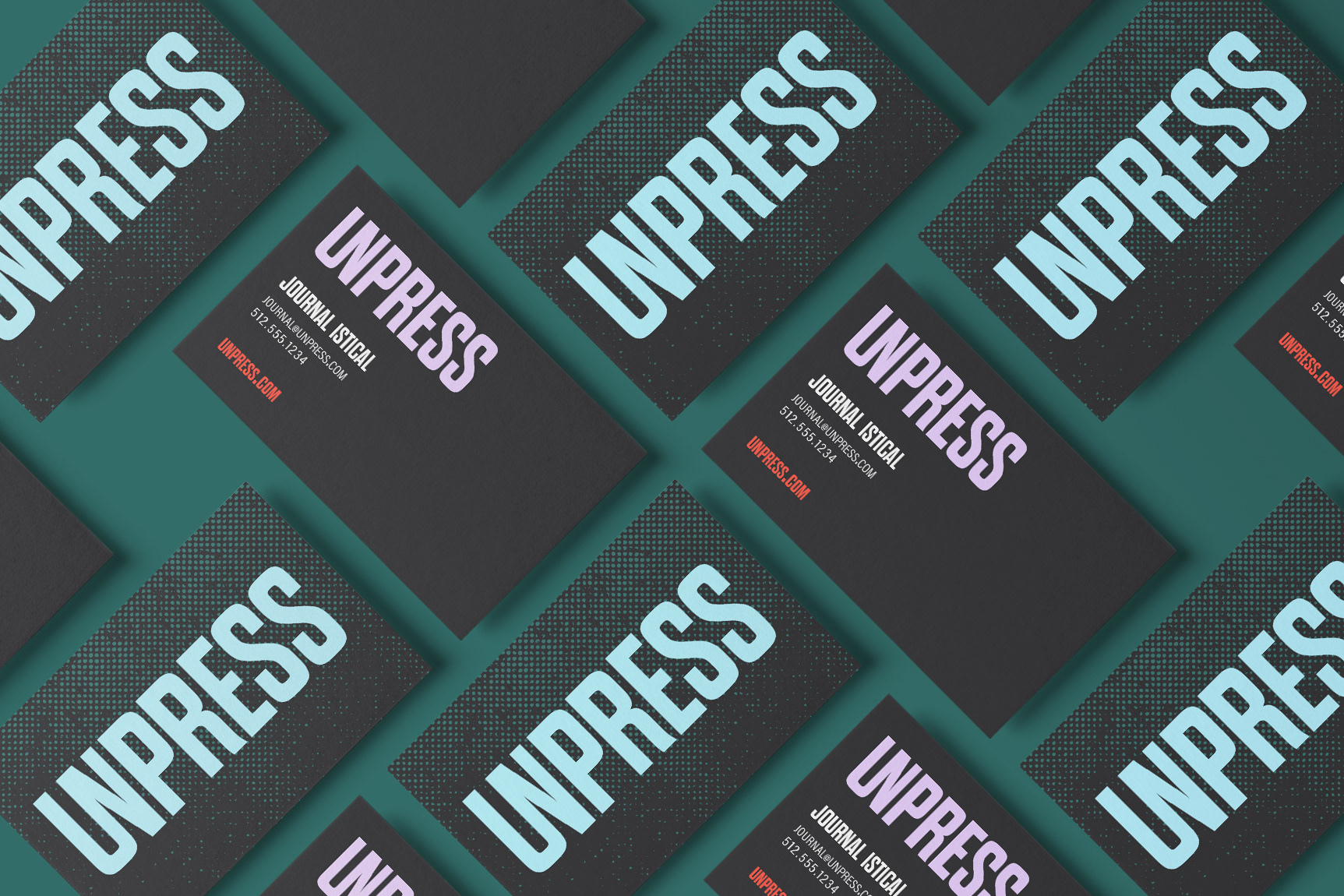
The logo
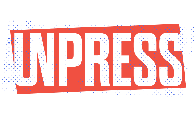
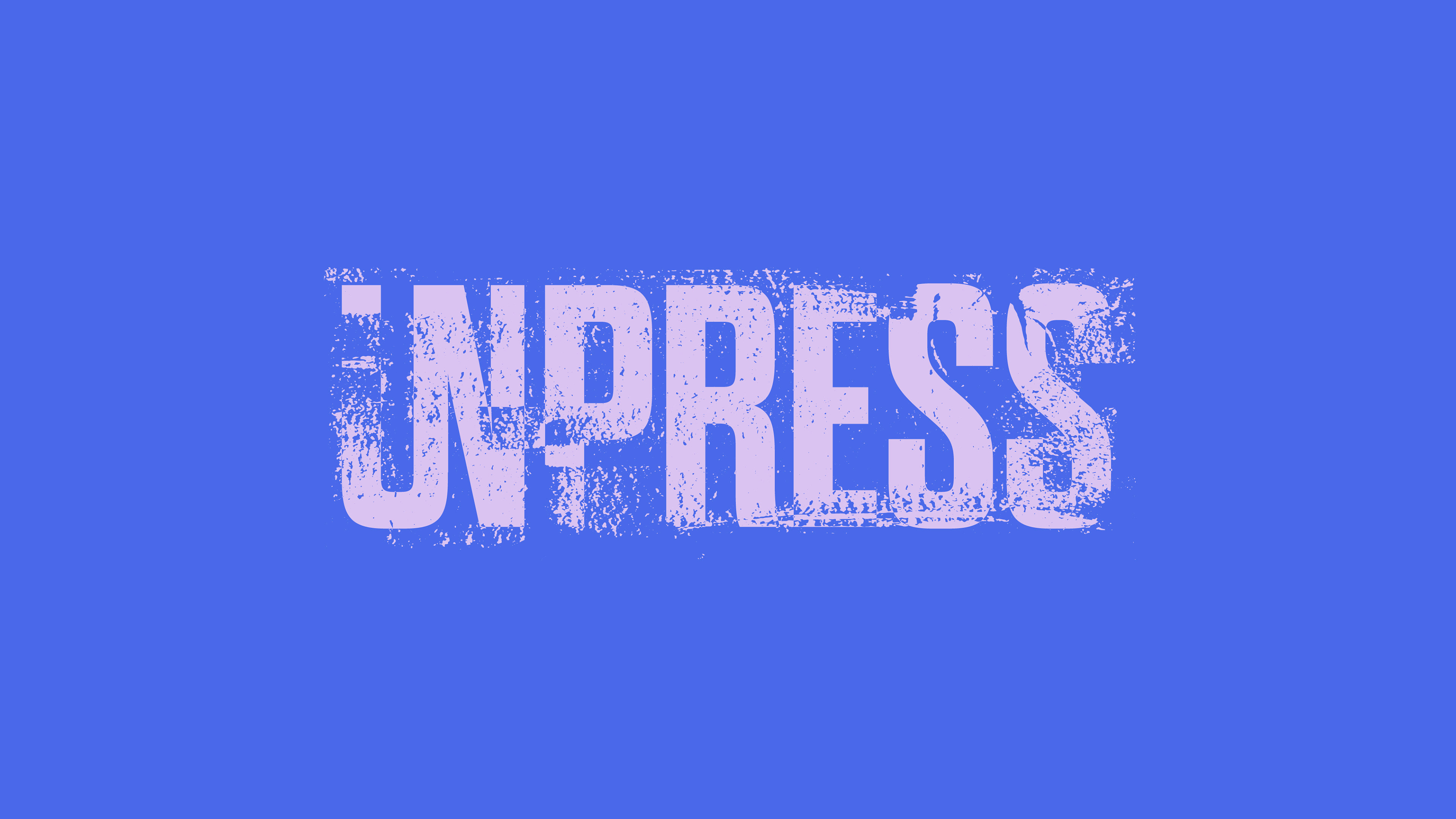
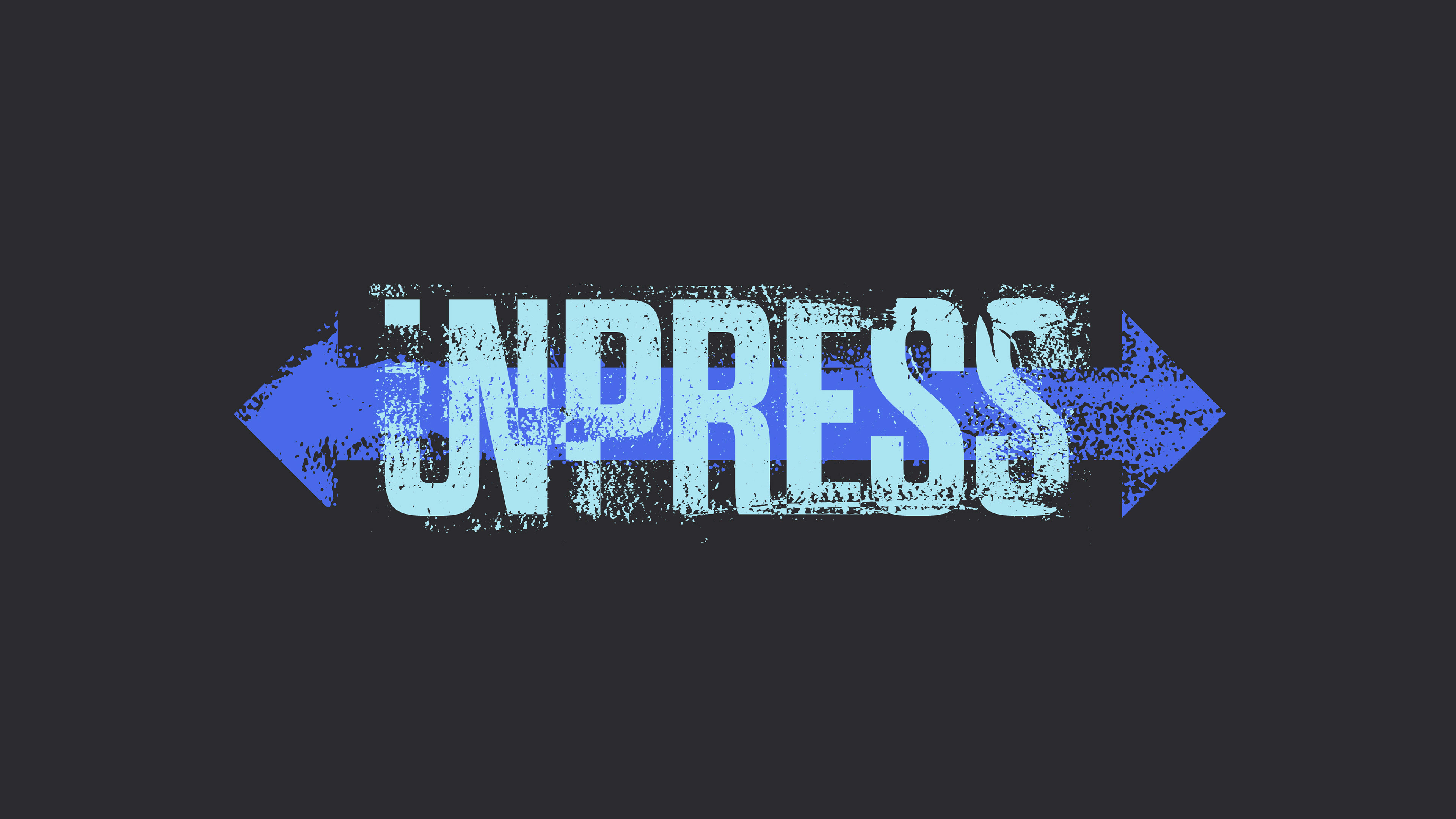
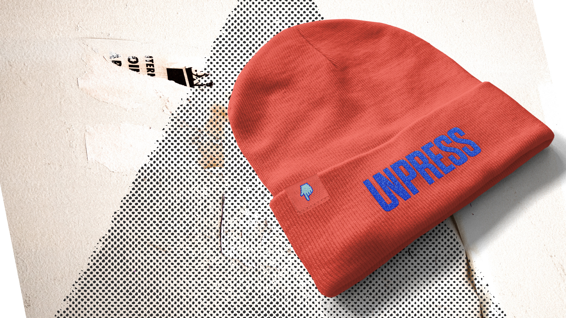
The primary logo, shown above, appears in clean crisp letters, with the U and N connecting into one. This connection speaks to rebellion, and a very "un" state of being. To truly embody the Outlaw archetype, I felt this brand needed a number of logo marks. We can see this logo with dragged out ink smears, with arrows pointing in either direction (to symbolize not taking sides), and also with a layered stamping effect.
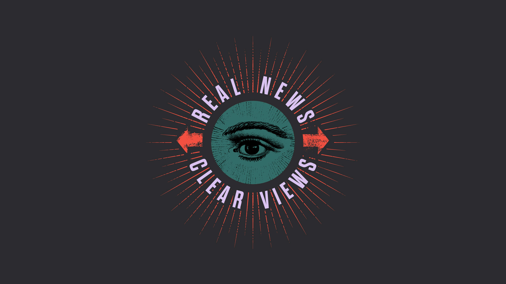
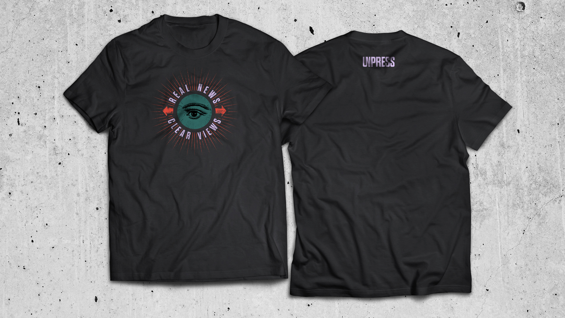
real news. clear views
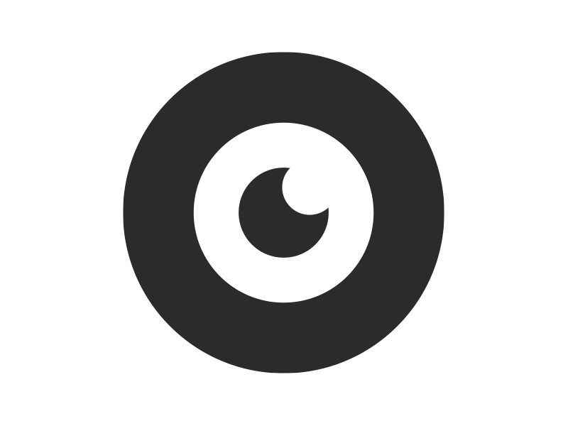
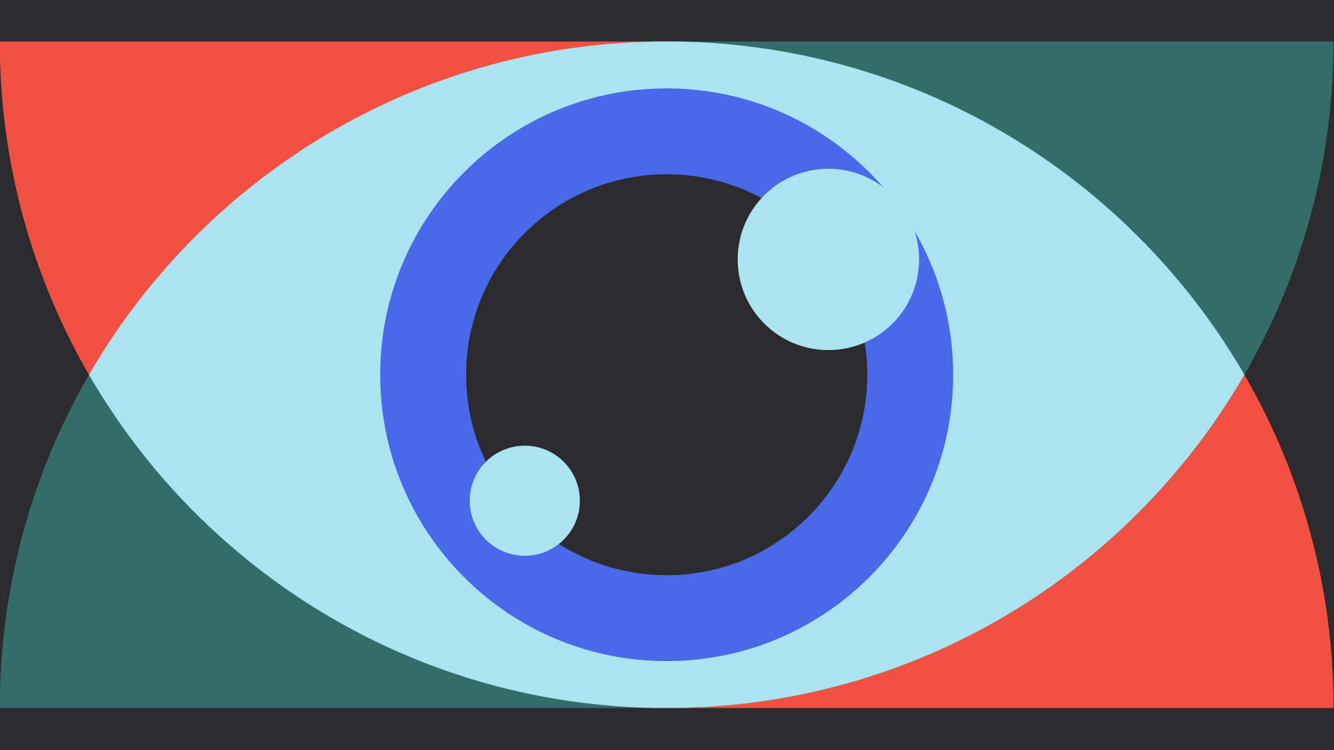
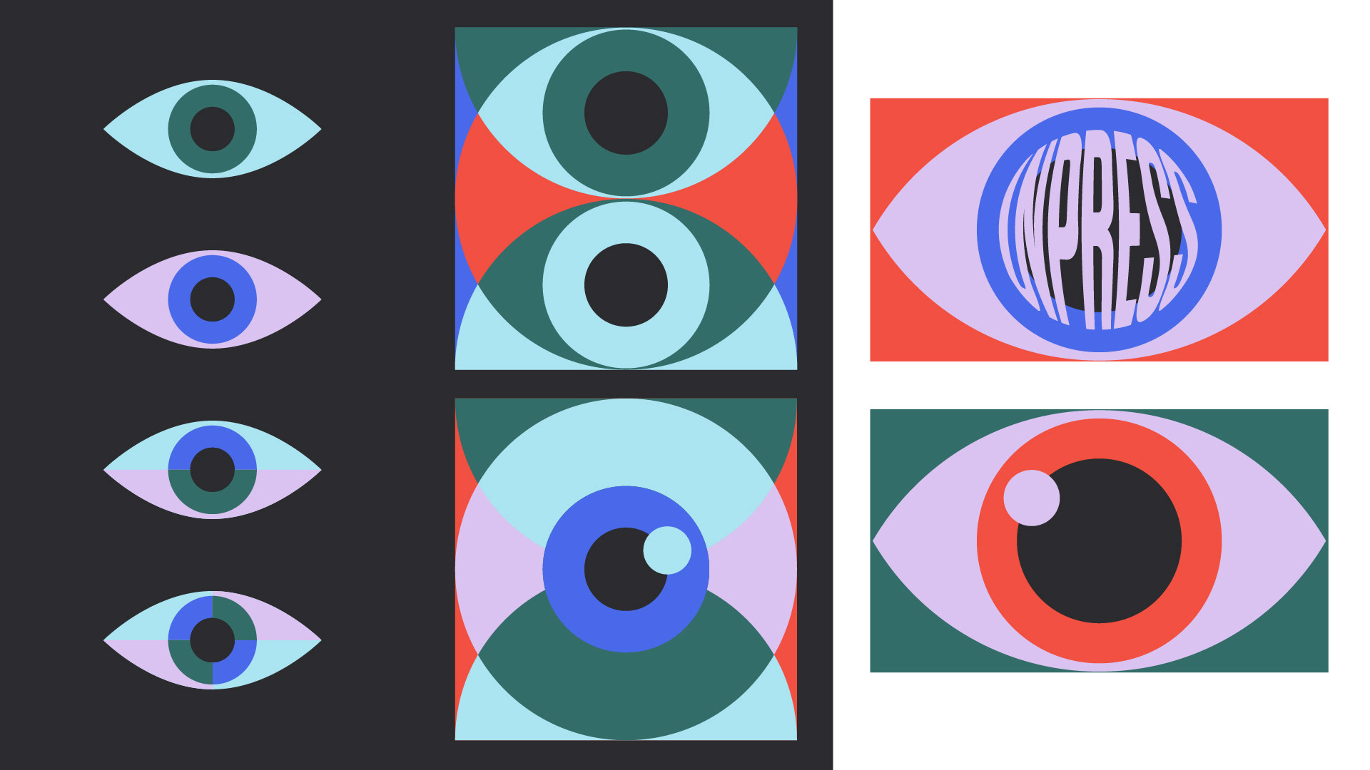
We are always watching, and being aware of what is around us. UnPress wishes to be truly transparent with a strong foundation rooted in truth. What better to symbolize honesty than an all knowing, all seeing eye? Numerous examples of how the eye could be utilized within the brand were created.
See the brand in action at unpress.news