The Ask
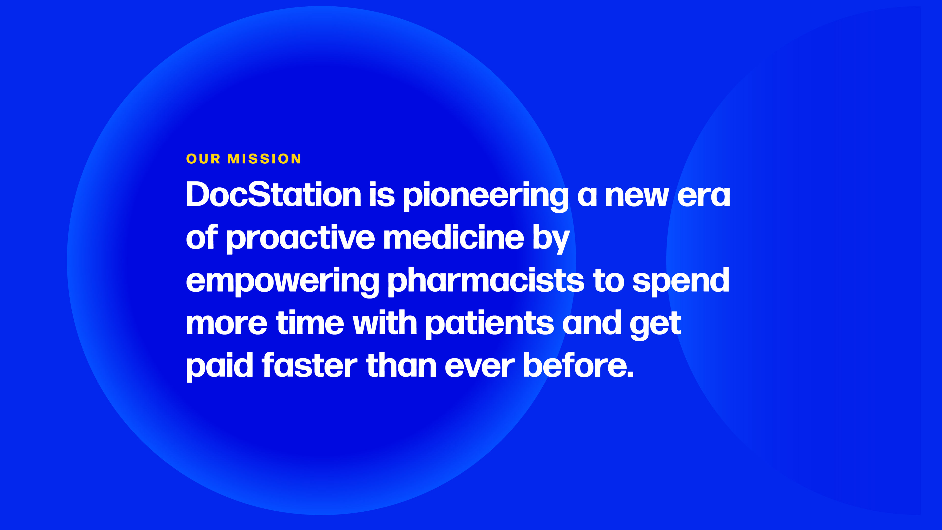
DocStation provides a better software solution for pharmacists. It allows all of the work to be done on a single platform, providing better communication between pharmacists, providers, and patients. It also allows for the team to be paid more quickly. DocStation is a fresh and modern solution, and they want their brand to reflect this. A Magician Archetype, they need to show that they are driven by innovation, creativity, and a journey to a better future.

The Brand
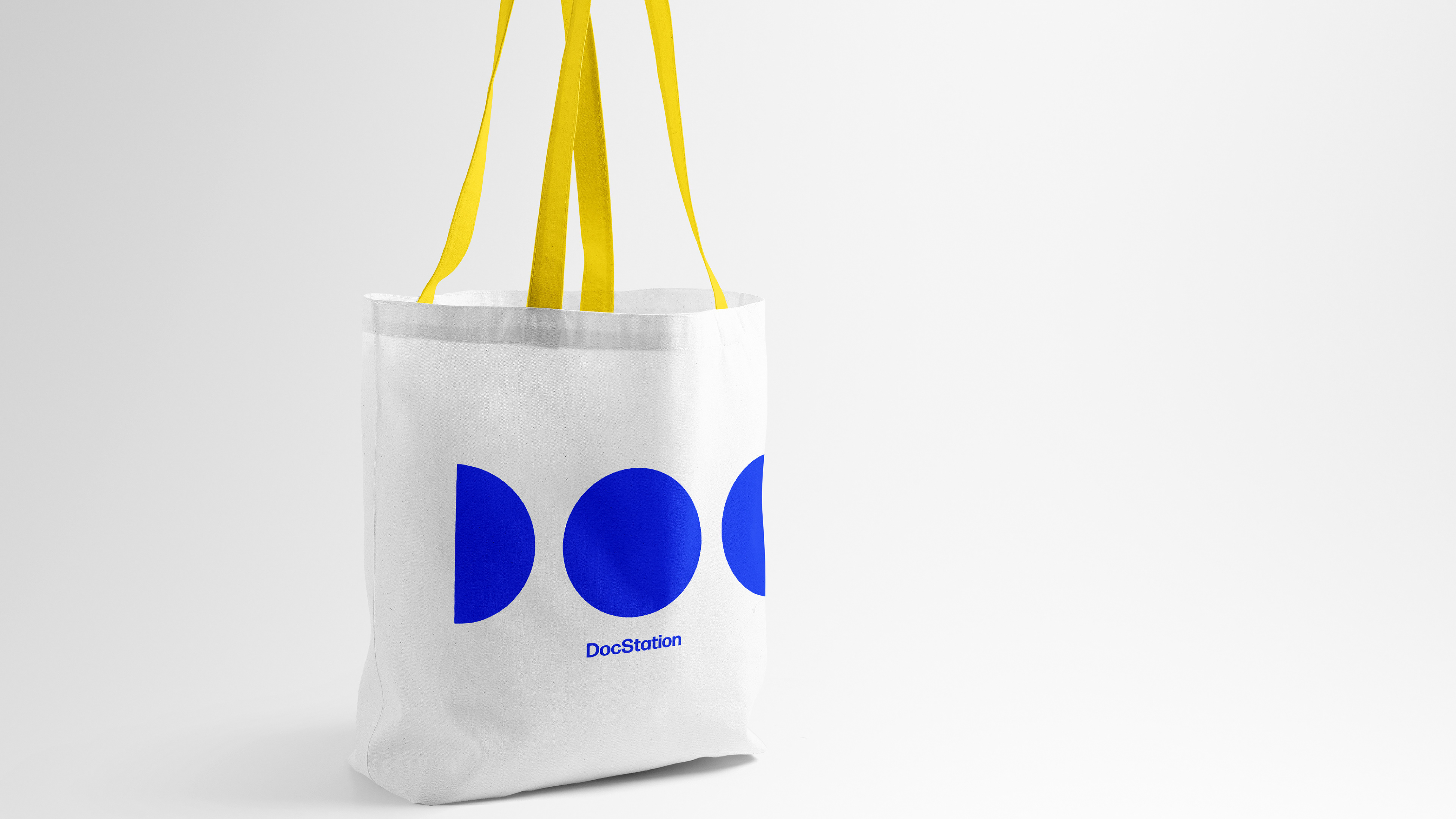
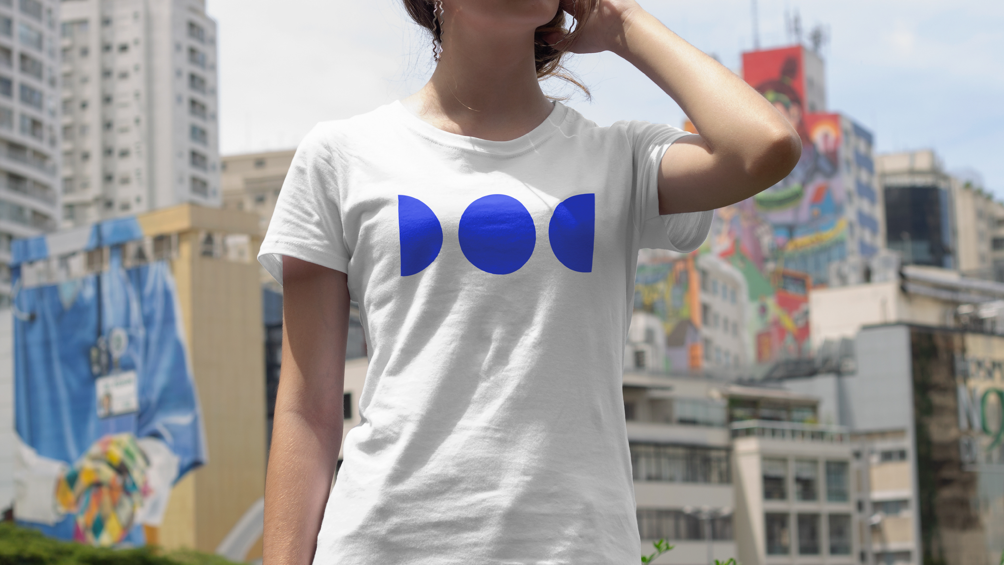
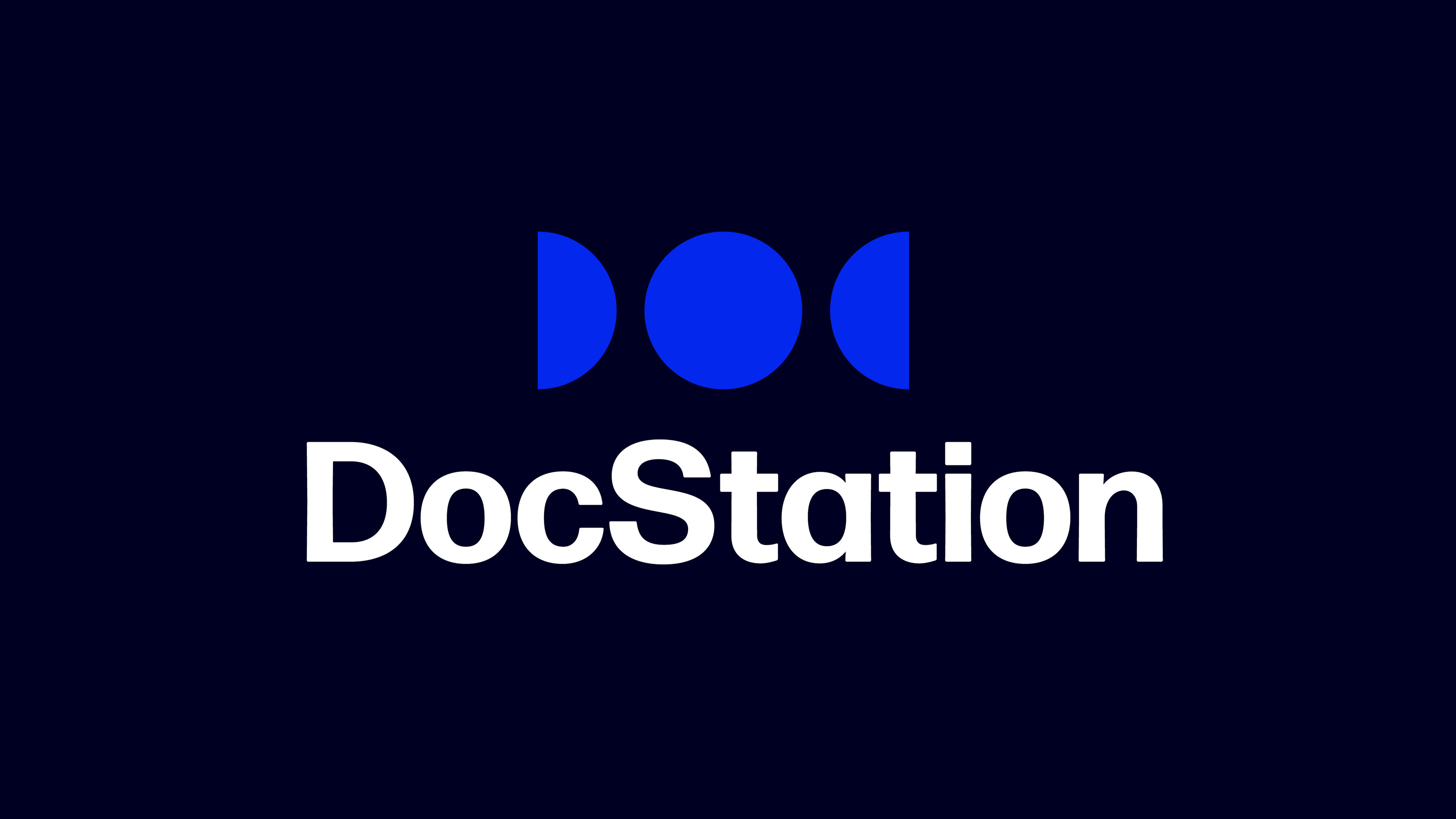
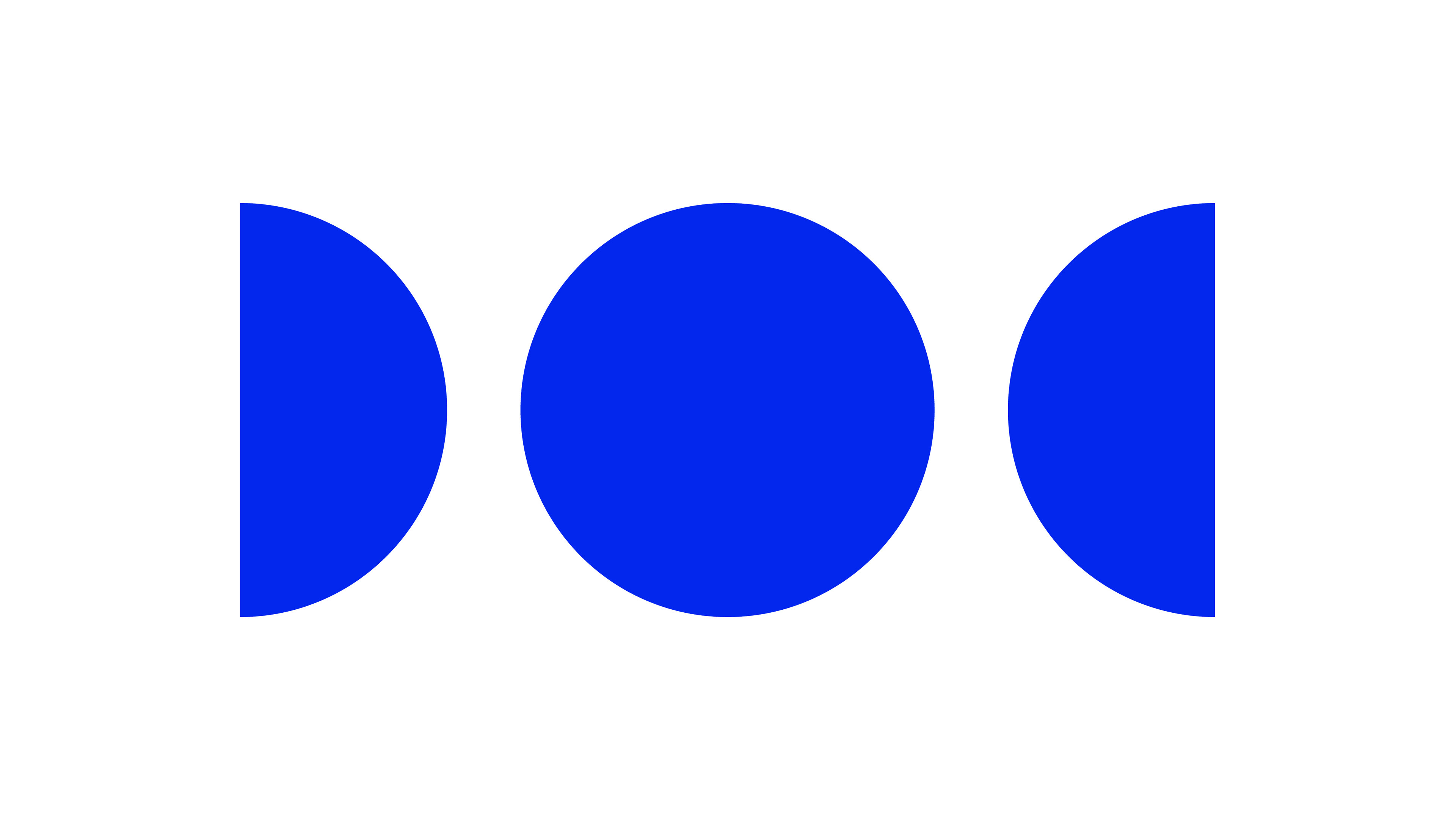
Being a Magician Archetype, I wanted the magic of the brand to be immediately recognized. Inspired by the moon's phases, I created a moon phase mark that clearly spells out the word "DOC" in all capitals. The phase mark speaks to how DocStation is phasing out the old pharmaceutical standard while phasing in the future of the industry. This mark does this in a simple and iconic manner.
It’s time that we phase out what is not working, and phase in a new dawn for pharmacies. The phases of the moon depicted in our brand are shining on a new era in seamless solutions. DocStation creates a new age of technology and health for our patients and pharmacists.
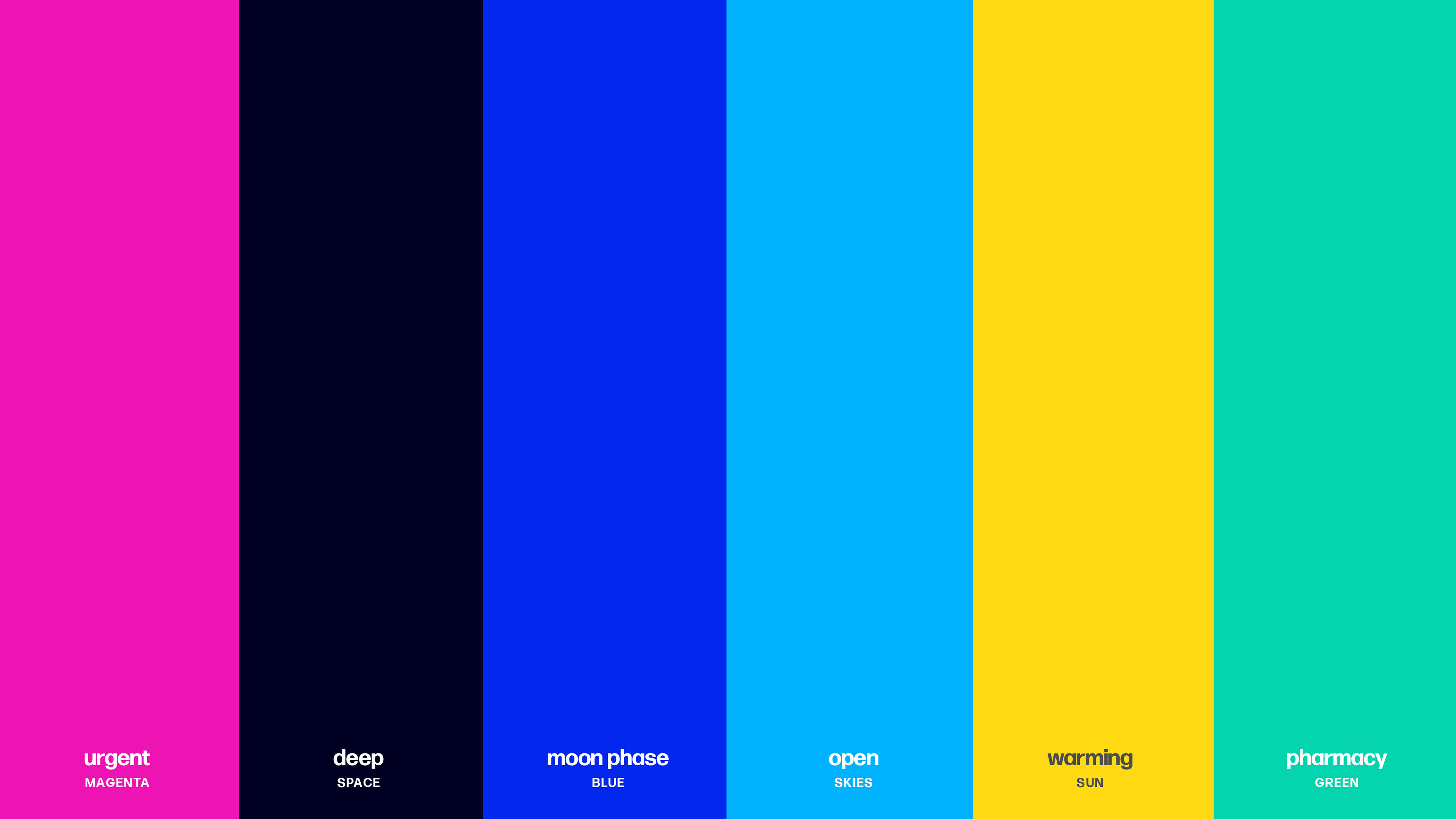
The color palette, typography, and graphic elements are warm, modern, and have a bit of a creative edge through their simplicity.