The Ask
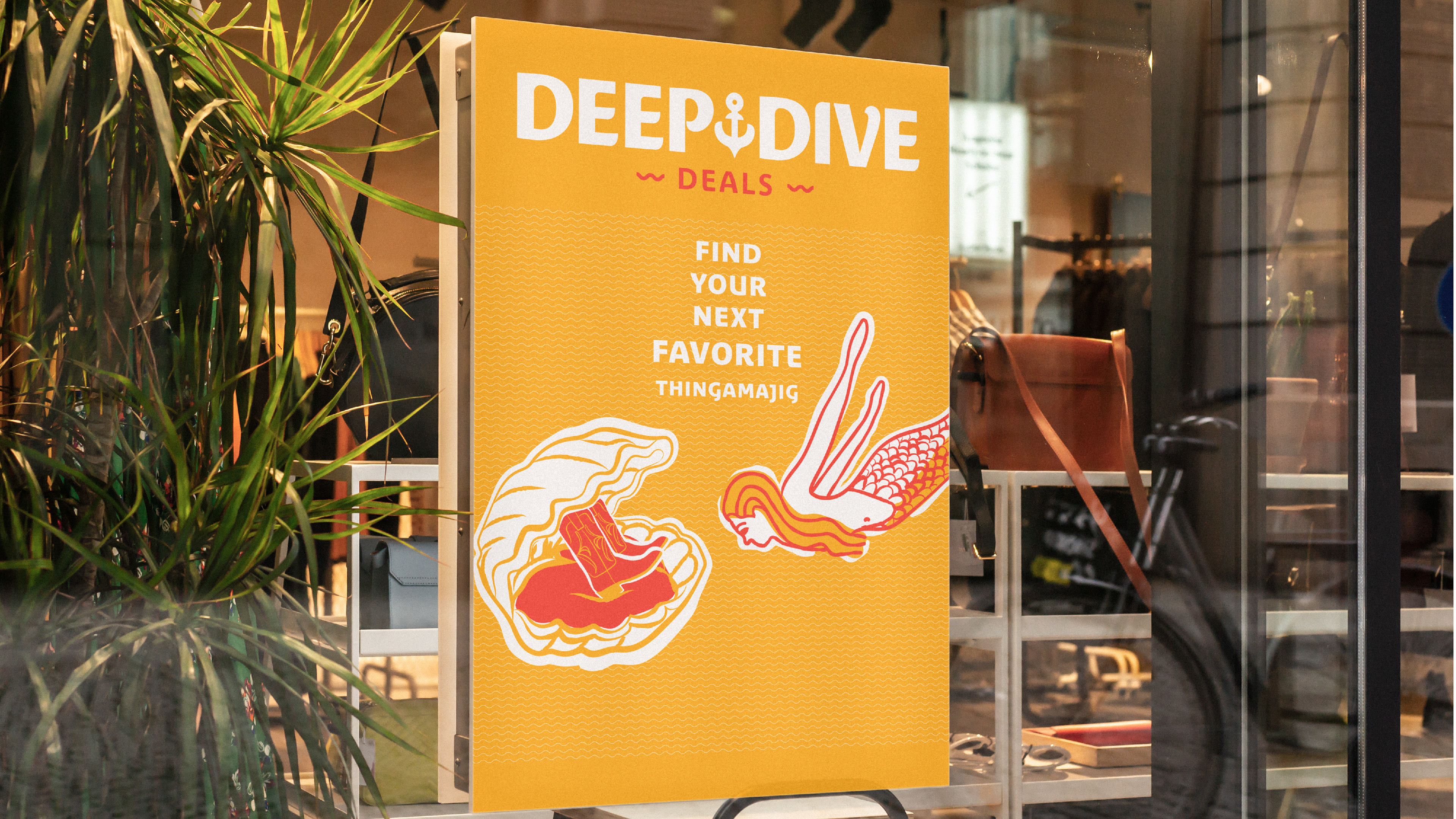
A discount store that buys merchandise in bulk, and fills bins for customers to "dive" through to find treasures at a flat price. The client wanted a brand that sets them apart from their competition, while still having authenticity and sense of being firmly established. Their archetype is the Jester; allowing them to exude a playful nature.
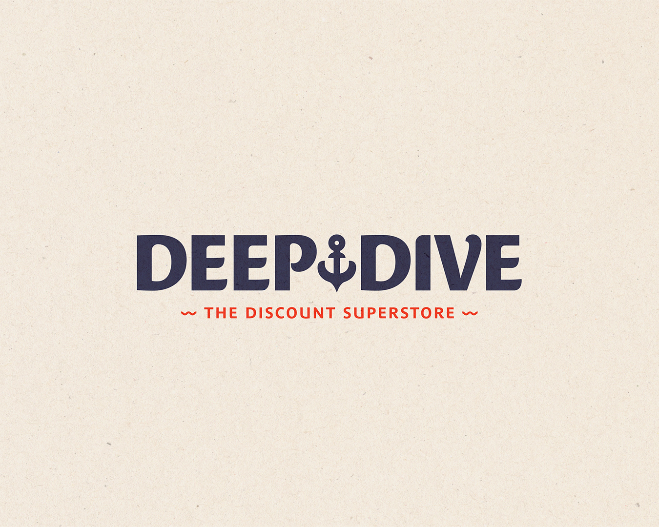
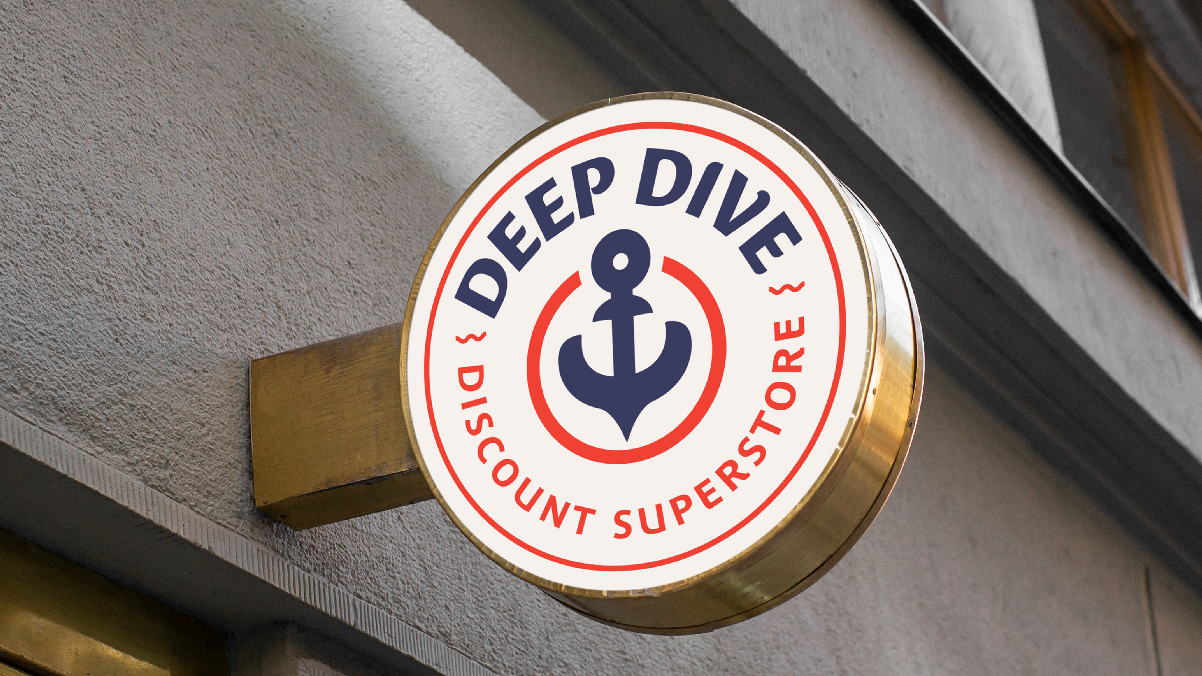
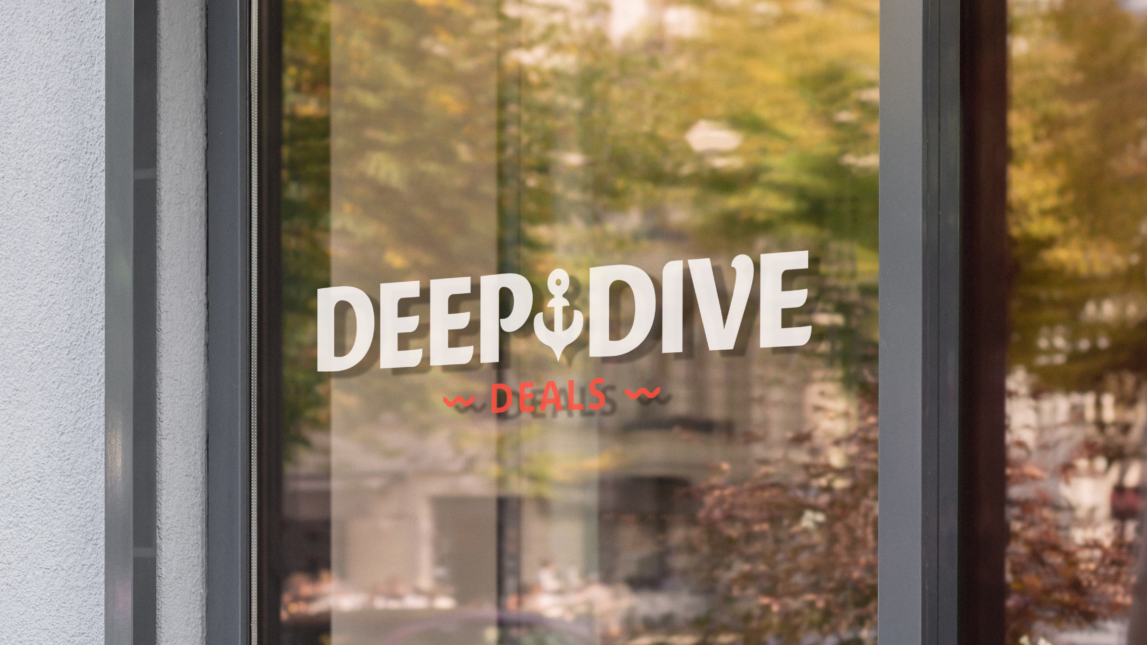
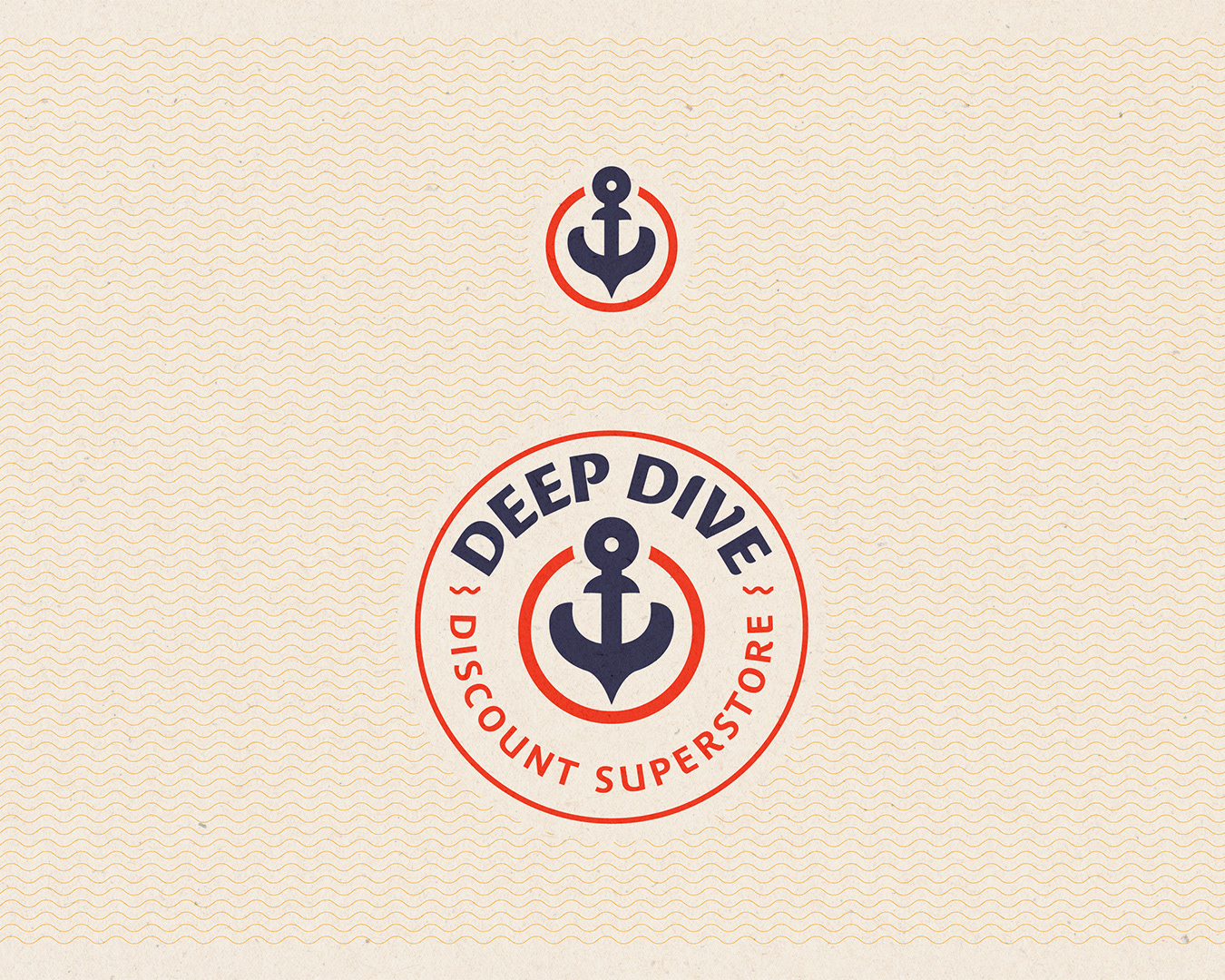
The Logo
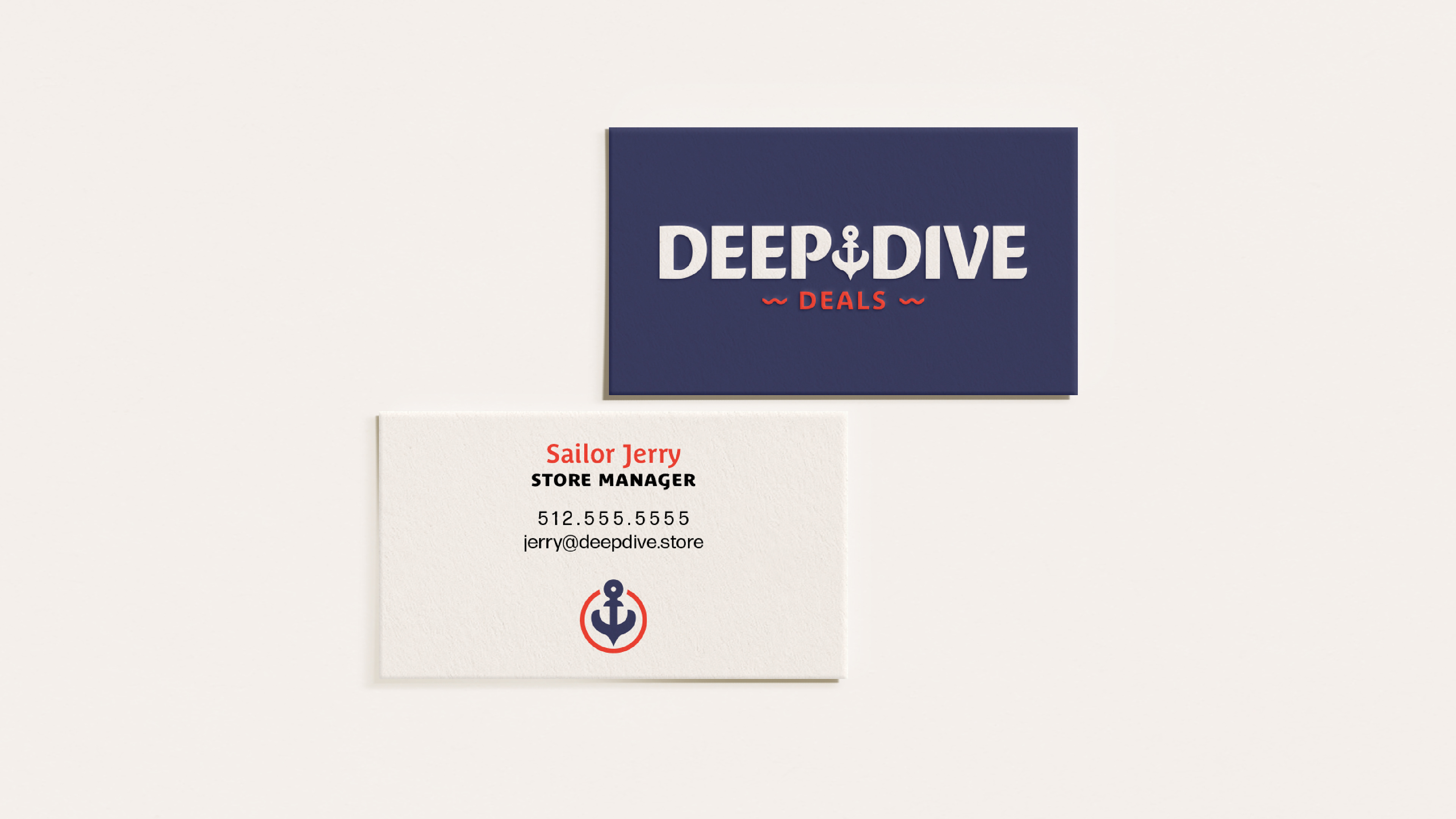
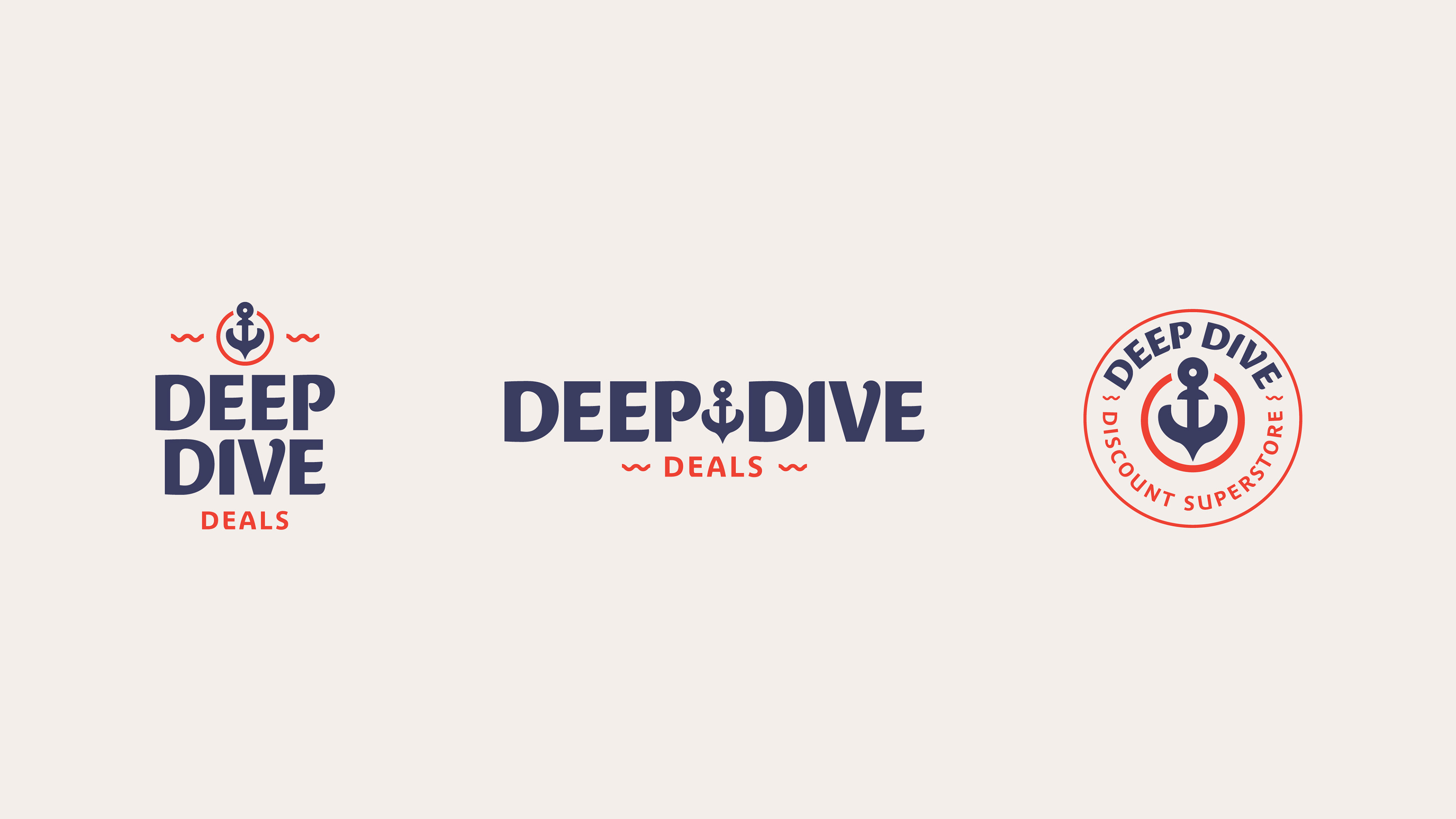
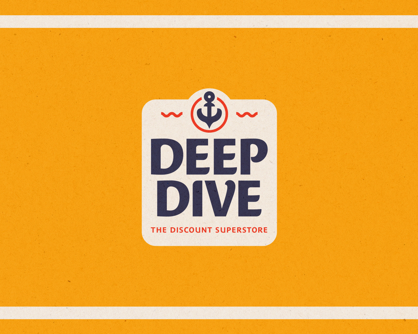
I wanted to craft a logo that looked established, authentic, nostalgic, and nautical. Some inspiration was drawn from retro themes. The typographic mark is customized. Drawn from the typeface Costa, it has been condensed. Curvatures have been added to the letters to make it appear to be more fluid. The anchor, signifying a dive to the bottom, was created using the flip inside the letter 'P'. The "Deals" themselves, lurk down at the bottom.
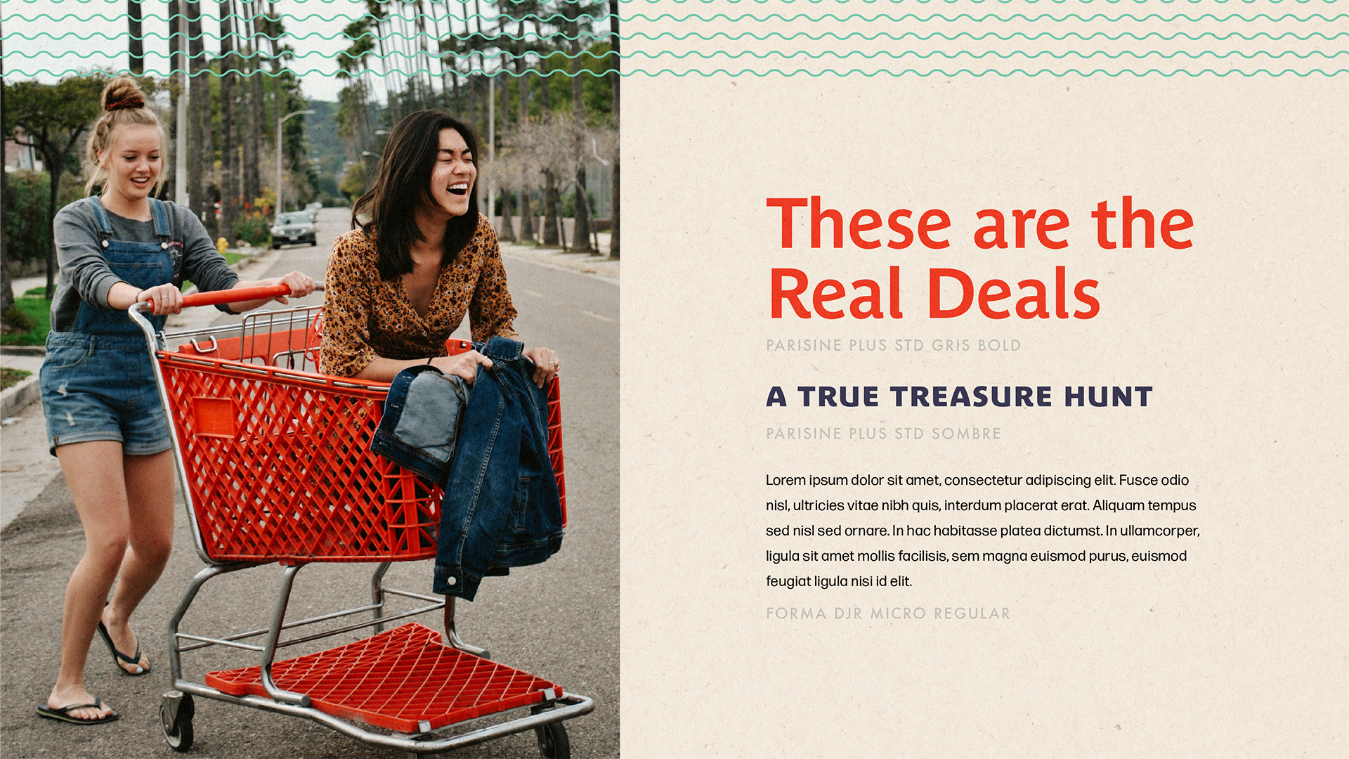
The Story
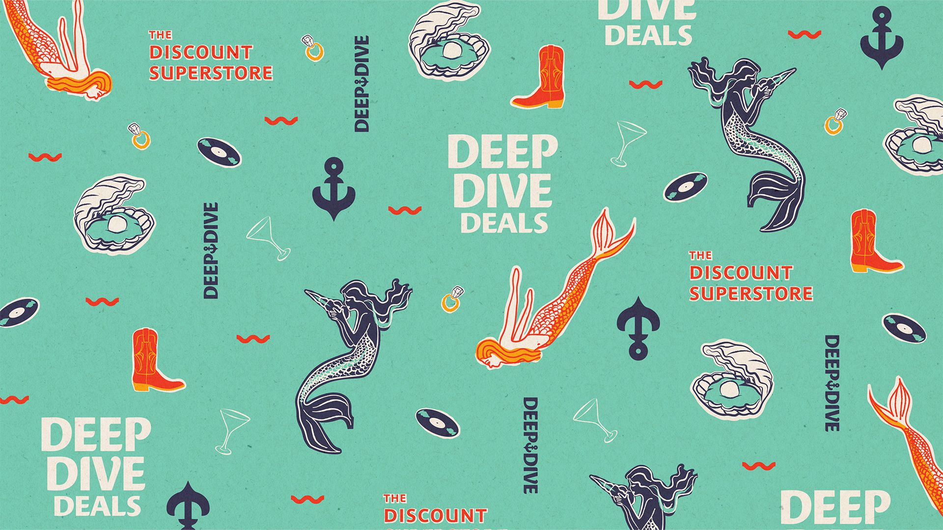
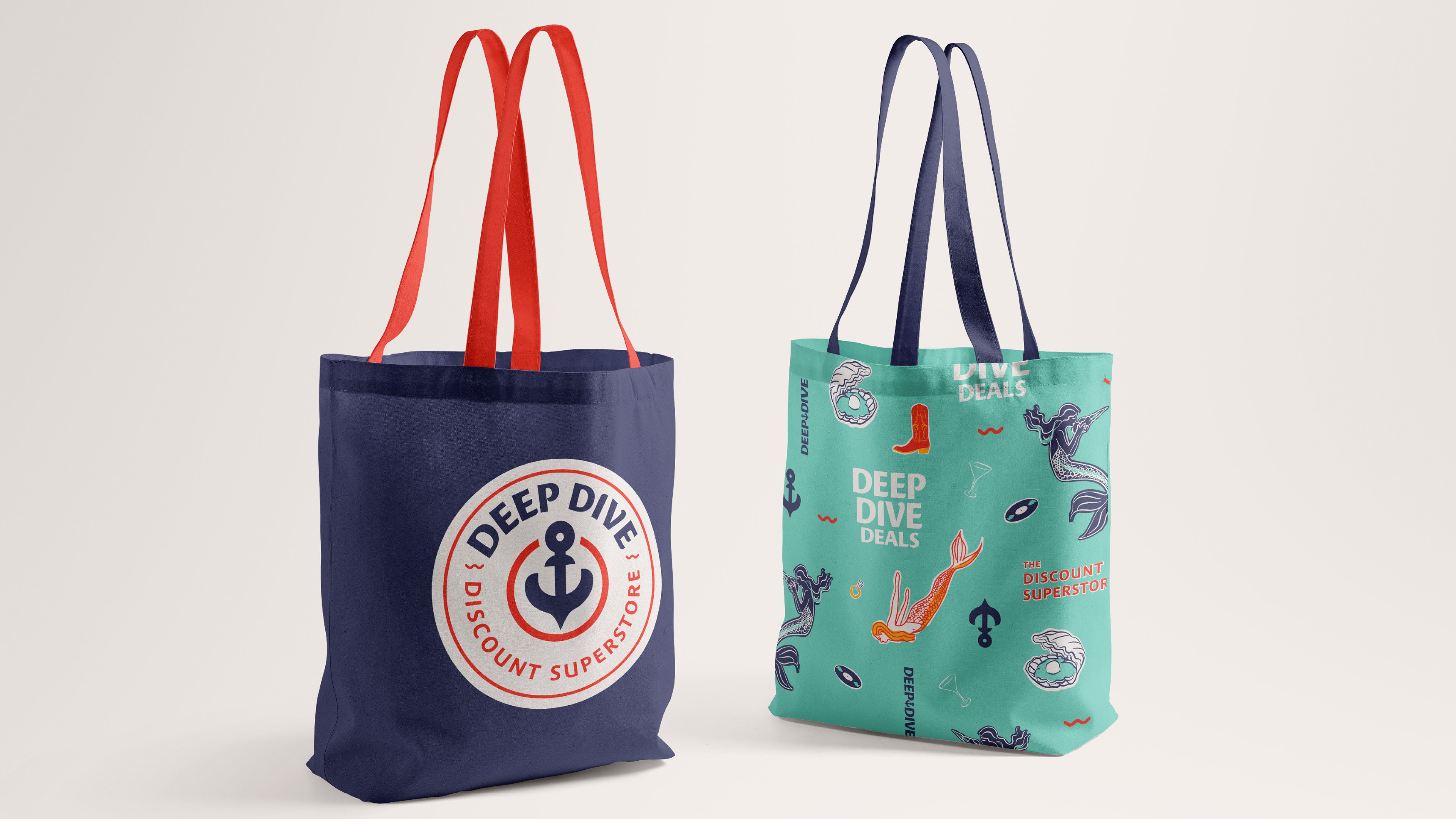
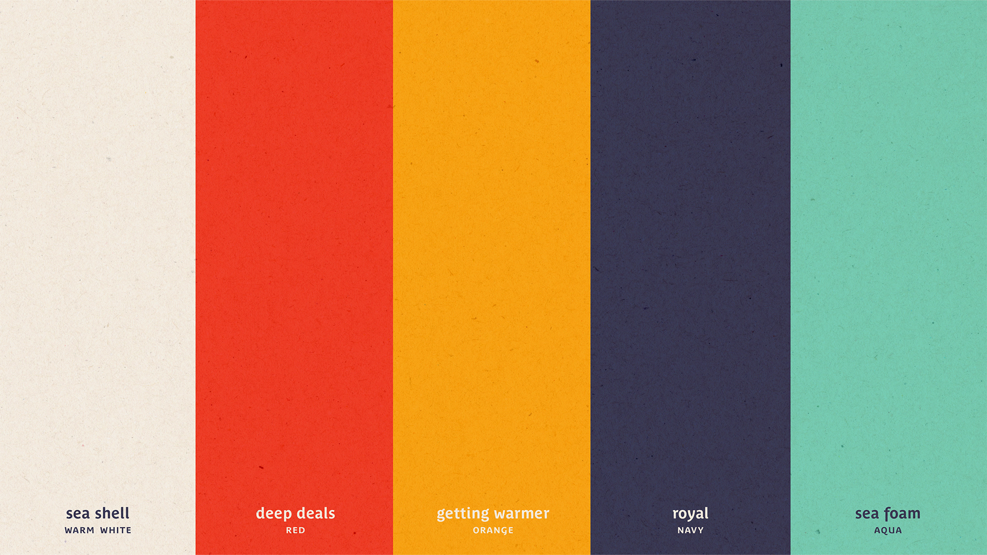
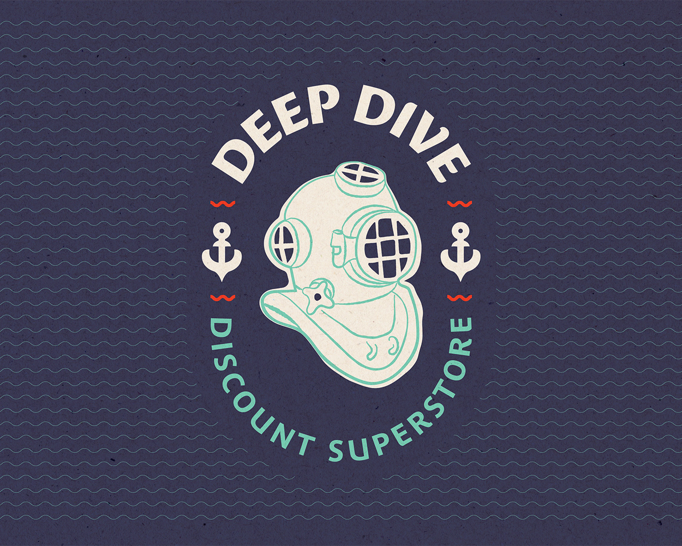
Imagine being able to dive into the Little Mermaid’s treasure trove. Couldn’t your collection be complete? Couldn’t you have…anything? This is a playful retelling of the mermaid’s collection utilizing retro themes, charming hand drawn illustrations, a warm color palette, and simple textures. It feels inviting and collectible.